Make Your Social Media Posts Pop: Essential Typography Tips for Beginners
Do your social media posts often feel a bit… flat? Like your message gets lost in a sea of visuals, or the text is just hard to read? You’re not alone! Many aspiring designers struggle to make their words truly stand out on platforms like Instagram, Facebook, or Pinterest. The secret to eye-catching and effective social media content often lies in mastering Typography for Social Media. It’s not just about picking a pretty font; it’s about making strategic choices that enhance readability, create visual impact, and communicate your message clearly.
This guide is your practical roadmap to transforming your social media text from ordinary to extraordinary. We’ll break down essential typography principles, show you how to apply them using accessible tools like Canva, and help you avoid common mistakes. Get ready to boost your online presence and ensure your message is not just seen, but truly read and remembered!
Table of Contents
Why Typography Matters for Your Social Media Posts
In the fast-paced world of social media, you have mere seconds to grab attention. Strong typography is your silent salesperson. It’s the visual voice of your content, influencing how your audience perceives your message and brand. When done well, effective Typography for Social Media:
- Grabs Attention: Bold, well-chosen fonts can stop scrollers in their tracks.
- Enhances Readability: Clear, legible text ensures your message is easily consumed, even on small screens.
- Builds Brand Consistency: Consistent font choices create a recognizable visual identity, making your content instantly identifiable.
- Conveys Emotion & Tone: Different typefaces evoke different feelings, setting the mood for your post.
- Guides the Eye: Smart typographic hierarchy leads viewers through your content in a logical flow.
Without thoughtful typography, your posts risk blending in, being overlooked, or worse, being unreadable. It’s a fundamental skill that transforms your content from merely existing to truly communicating.
Understanding Key Typography Principles for Social Media
To make your social media text shine, let’s explore the core principles of typography and how they apply directly to your posts.
Readability & Contrast: Making Your Message Clear
Readability is paramount on social media. People are often scrolling quickly, so your text needs to be easily digestible. This means choosing fonts that are clear and legible, especially at smaller sizes. Typography for Social Media thrives on strong contrast.
Ensure there’s a significant difference between your text color and the background color. Light text on a light background, or dark text on a busy dark background, is a common pitfall. If you’re placing text over an image, consider adding a solid color overlay with some transparency behind the text to ensure it pops.
Hierarchy: Guiding the Viewer’s Eye
Visual hierarchy tells your audience what’s most important. On social media, this means making your key message stand out. Use variations in font size, weight (boldness), and color to create a clear reading order.
Your main headline or call to action should be the most prominent element, followed by supporting details in a less dominant but still readable style. This guides the viewer’s eye, ensuring they grasp the core message first before delving into secondary information.
Font Pairing: Simple, Effective Combinations
You don’t need dozens of fonts to create an impactful post. In fact, fewer fonts often lead to a more professional look. The key is finding one or two fonts that complement each other. A common and effective approach for Typography for Social Media is to pair a strong, attention-grabbing font for headlines with a clean, highly readable font for smaller text.
For example, a bold sans-serif font for a headline can be beautifully balanced by a classic serif font for a sub-message or author credit. Focus on creating visual harmony and ensuring both fonts are legible.
Visual Balance with Text: How Text Interacts with Images
Social media posts are often a blend of images and text. The text needs to feel integrated and balanced with any visual elements. Avoid placing text in areas of an image that are too busy or have too many competing details. Use negative space (empty areas) around your text to give it room to breathe and stand out. This applies to Typography for Social Media as well.
Also, consider the overall composition. If your image has a strong focal point on one side, you might balance it with text on the other side. The goal is to make the entire post feel cohesive and harmonious, with text and image working together, not against each other.
Step-by-Step: Crafting a Social Media Post with Impactful Typography
Ready to put these typography tips into practice? Let’s walk through creating a social media post using a free, accessible tool like Canva.
Materials You’ll Need:
- A computer or smartphone with internet access
- A free Canva account (Canva.com)
- Your message/quote for the post
- An image or background idea
- About 30-45 minutes of your time
Step 1: Choose the Right Template or Canvas
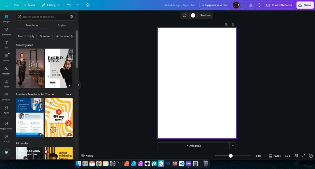
Open Canva in your web browser or launch the app. Once logged in, search for “Instagram Post” (or your preferred social media platform and format). This sets up your canvas with the correct dimensions.

Browse through the available templates. Don’t feel you have to pick the perfect one right away. Look for a template with a clean layout and a text style that you generally like. You’ll customize it to make it your own.
Step 2: Select Your Fonts Wisely
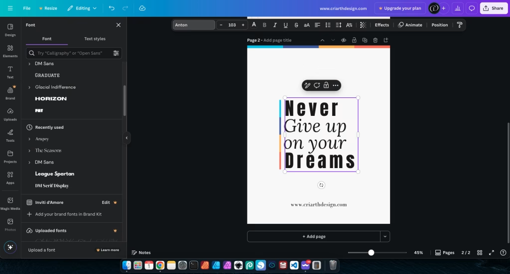
Click on any existing text box in your chosen template, or add a new one by clicking “Text” in the left sidebar. Now, it’s time to choose your fonts. For your main message or headline, select a font that is bold and clear. For any supporting text, choose a highly readable font that complements your headline font.

Canva often suggests font pairings, which can be a great starting point for beginners. Aim for contrast in style or weight, but always prioritize legibility.
Step 3: Adjust Size, Spacing, and Color for Readability
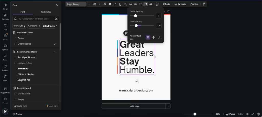
Once you’ve chosen your fonts, adjust their size. Your main message should be the largest, followed by secondary text. Pay attention to “Line Spacing” (also called leading) to ensure enough space between lines of text, making paragraphs easier to read. “Letter Spacing” (tracking) can also be adjusted for headlines to fine-tune their appearance.

For colors, select a text color that provides strong contrast against your background. Use Canva’s color picker to ensure good readability. Avoid busy background images if your text color is light.
Step 4: Create Visual Hierarchy
Now, let’s apply hierarchy. Make your most important piece of information the largest and boldest. Place it in a prominent position, typically at the top or center, or where the eye naturally lands (e.g., following the rule of thirds if you’re using an image). Your supporting text should be smaller but still clear.
This creates a visual flow, guiding your audience to the key message first. Don’t try to make everything scream for attention; that just makes everything blend into noise.
Step 5: Ensure Text-Background Contrast
If your post includes an image background, it’s crucial to ensure your text is still highly readable. If the image is busy, consider adding a transparent overlay or a solid shape behind your text. This creates a “safe zone” for readability.

Canva allows you to easily add shapes (under “Elements”) and adjust their transparency. This simple step can dramatically improve the legibility of your Typography for Social Media posts.
Once you’re happy with your design, double-check for typos and alignment. Then, click “Share” and “Download” (PNG is usually best for high quality) to save your stunning new social media post!
Common Typography Mistakes on Social Media (and How to Avoid Them)
Even with the best intentions, beginners often make a few common typography mistakes on social media. Being aware of these can help you create more effective and professional posts.
- Too Many Fonts: Using three, four, or even more different fonts in a single post creates visual chaos. It looks unprofessional and makes your message hard to follow.
- How to Avoid: Stick to a maximum of two font families per post. One for headlines, one for body text. Use different weights (bold, regular) or styles (italic) within those two families for variation.
- Low Contrast Text: Placing light gray text on a white background, or dark text over a dark, busy photo, makes your message almost invisible.
- How to Avoid: Always ensure strong contrast. Use a light font on a dark background, or a dark font on a light background. If using an image, add a solid or semi-transparent overlay behind your text to make it pop.
- Overcrowding: Trying to cram too much text, too many icons, and too many ideas into one small social media graphic overwhelms the viewer.
- How to Avoid: Less is often more. Focus on one main message per post. Keep your text concise and to the point. Use ample white space around your text and elements to give the design room to breathe.
- Ignoring Mobile Readability: What looks good on a large computer screen might be tiny and illegible on a smartphone.
- How to Avoid: Always test your social media posts on your phone before publishing. Zoom in if necessary. Ensure your chosen font sizes are readable on the smallest screen your audience will use.
- Inconsistent Styling: Using different font styles, colors, or text effects randomly across your posts.
- How to Avoid: Develop a simple “brand guide” for your social media. Decide on your primary and secondary fonts, a consistent color palette, and how you’ll use them. Stick to these choices across all your posts to build strong recognition.
Tips for Practicing Typography for Social Media
Like any skill, mastering Typography for Social Media takes practice. Here are some quick tips to help you keep learning and improving:
- Daily Observation: Pay attention to the social media posts you see every day. Which ones have great text? Why? Analyze their font choices, sizes, and how they use contrast.
- Recreate Designs: Find a social media post with typography you admire. Try to recreate it yourself in Canva or another tool. This helps you understand the designer’s choices.
- Seek Feedback: Share your practice posts with friends or online design communities. Ask for specific feedback on the readability and impact of your text. Be open to constructive criticism.
- Experiment Fearlessly: Try different font combinations, colors, and layouts. The beauty of digital tools is that you can always undo or discard versions you don’t like. Play around!
- Focus on One Principle: For a week, focus only on contrast. The next week, focus on hierarchy. This focused practice helps you master each element individually.
Conclusion
You’ve now taken a significant step towards mastering Typography for Social Media posts! You’ve learned why font choices, size, spacing, and color contrast are crucial for readability and impact. You have practical, step-by-step guidance on how to create compelling posts using a tool like Canva, and you know how to avoid common pitfalls that can undermine your message.
Remember that design is a journey of continuous learning and practice. Don’t be afraid to experiment, iterate, and refine your approach. Your social media presence is a powerful tool for communication, and with strong typography, you can ensure your voice is heard loud and clear. Keep designing, keep learning, and watch your posts truly pop!
Recommended Reading:
– Unlock the Secrets of Stunning Typography for Beginners – Dive deeper into the art of arranging type, from font selection to advanced spacing techniques, to make your text truly shine.
External Reference:
Hootsuite: Social Media Image Sizes Guide – A comprehensive guide to optimal image sizes for various social media platforms, essential for ensuring your typography fits correctly.


