Unlock Stunning Text: Easy Font Tools for Beginners!
Have you ever seen a design where the text just *pops*, making the message instantly clear and beautiful? Or perhaps you’ve struggled to make your words look appealing, feeling overwhelmed by countless font options and complex settings? You’re not alone! Many aspiring designers find themselves lost when it comes to typography. But what if there were Easy Font Tools designed specifically to help you create amazing text, even if you’re just starting out? This guide is your key to mastering text design effortlessly, transforming your creative projects from good to great.
Understanding how to choose and apply fonts effectively is a superpower in design. It’s not about memorizing every font or complex software features. Instead, it’s about leveraging simple, user-friendly tools that put the power of professional typography at your fingertips. These tools help you confidently select fonts, create harmonious pairings, and apply stylish effects without the steep learning curve. By the end of this article, you’ll be equipped to make your text not just readable, but truly captivating, adding a polished touch to all your logos, flyers, and social media posts.
Table of Contents
What Are Easy Font Tools?
Easy Font Tools are software applications, often web-based, designed to simplify the complex world of typography for beginners. Unlike professional-grade software like Adobe Illustrator or Photoshop, which offer deep control but come with a steep learning curve, these tools prioritize accessibility and speed. They provide intuitive interfaces, pre-designed templates, and curated font libraries, allowing you to achieve professional-looking results with minimal effort.
Think of them as smart assistants for your text. Instead of manually adjusting every kerning pair or struggling with font compatibility, these tools automate many processes and offer visual guidance. They empower users to focus on the creative aspect of text design—choosing the right mood, emphasizing key messages, and ensuring readability—rather than getting bogged down in technical intricacies. This focus on user-friendliness makes them ideal for anyone new to graphic design or digital content creation.
The Core Philosophy: Simplicity & Accessibility
The fundamental principle behind Easy Font Tools is to democratize typography. They are built on the idea that beautiful text shouldn’t be exclusive to seasoned professionals. This is achieved through:
- Intuitive Interfaces: Drag-and-drop functionality, clear menus, and visual previews make them easy to navigate.
- Template Libraries: Pre-designed text layouts and font pairings provide a professional starting point.
- Curated Font Collections: Instead of thousands of fonts, they offer a manageable selection of high-quality, versatile typefaces.
- Automated Adjustments: Many tools automatically handle spacing and alignment, ensuring good readability.
These features combine to create an environment where beginners can experiment with typography basics confidently, leading to quick wins and a deeper understanding of how fonts impact design.
Why Use Easy Font Tools for Your Designs?
For beginners, the benefits of using Easy Font Tools are immense. They remove common barriers, accelerate your learning, and help you produce impactful visuals much faster than traditional methods.
Overcome the Intimidation Factor
Professional design software can be daunting. Learning complex menus, understanding vector paths, or mastering intricate layer masks can feel like a huge mountain to climb just to change a font. Easy Font Tools strip away this complexity, offering a friendly entry point. You can focus on the creative decisions—what message to convey, what mood to set—rather than wrestling with the software itself.
Achieve Professional Results, Faster
These tools come equipped with expertly designed templates and pre-selected font pairings. This means you can create polished, cohesive text designs in minutes, even if you have no prior experience. Whether you need a catchy headline for a social media post or clear text for a flyer, the guesswork is largely eliminated. This efficiency is a game-changer for anyone needing quick, high-quality visuals.
Learn by Doing with Instant Feedback
The visual nature and immediate feedback loop of Easy Font Tools make learning highly effective. You see the impact of your font choices, size adjustments, and color changes in real-time. This hands-on experimentation is crucial for developing your eye for design and understanding text design tips organically. You learn what works and what doesn’t, quickly building your intuitive design sense.
Experiment with Confidence
With simple undo functions and a forgiving interface, these tools encourage experimentation. You can try out countless font combinations and styles without fear of ruining your project. This freedom to play is vital for fostering creativity and discovering unique creative font usage that reflects your personal style. It turns learning into an enjoyable exploration.
Comparing Easy Font Tools: Canva vs. Google Fonts
While many tools offer easy font features, let’s look at two popular and distinct examples: Canva and Google Fonts, representing a full-fledged design platform and a dedicated font resource.
Canva: Your All-in-One Text Design Studio
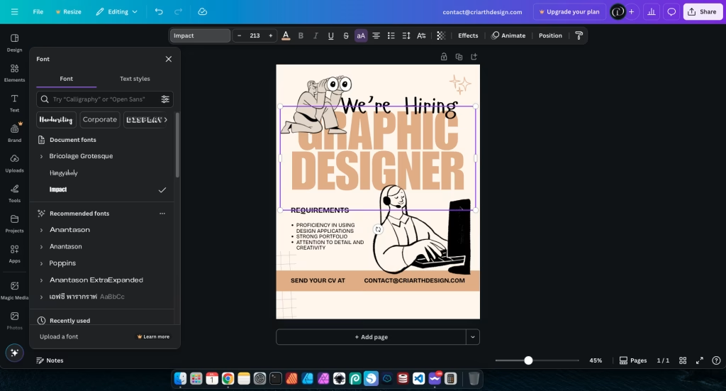
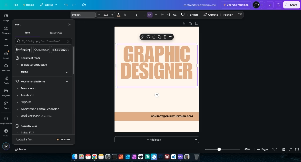
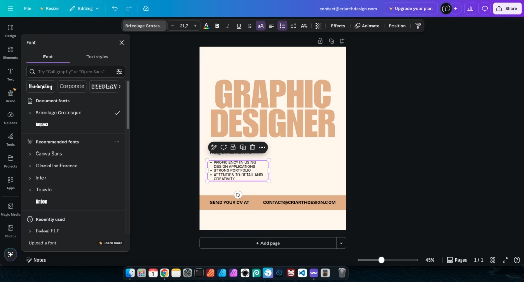
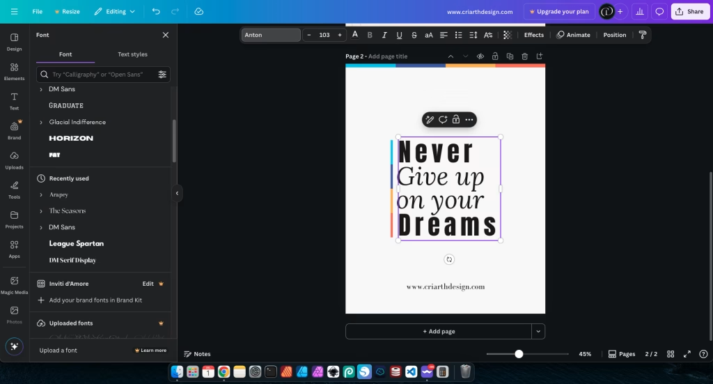
Canva is a comprehensive graphic design platform that excels at making text design accessible. It offers a vast library of fonts, pre-designed text layouts, and intuitive controls for sizing, coloring, and adding effects to text. You can easily drag and drop text boxes, choose from recommended font pairings, and apply stylistic elements with a few clicks. Its strength lies in integrating font tools seamlessly within a broader design environment, perfect for creating complete graphics like social media posts or flyers.
- Pros: Integrated design environment, vast template library, easy drag-and-drop, quick effects.
- Cons: Full font library and advanced features often require a paid subscription.

Google Fonts: The Power of Free Font Discovery
Google Fonts isn’t a design tool in itself, but it’s an indispensable resource for discovering and pairing free font pairings. It offers a massive collection of high-quality, open-source fonts that you can download and use in any design software (including Photopea, Figma, or even Canva if you upload them). Its strength lies in its extensive library and its pairing suggestions, helping you find fonts that complement each other.
- Pros: Huge library of free fonts for commercial use, excellent for font discovery and pairing, integrates with many web platforms.
- Cons: Not a design tool; you need separate software to use the downloaded fonts.
Comparison: While Canva is ideal for quick, integrated text design, Google Fonts is paramount for font discovery and building your own font library for use across various tools. Many designers use both: finding fonts on Google Fonts and then applying them in platforms like Canva or Photopea.
Step-by-Step: Mastering Text with Easy Font Tools
Ready to create amazing text? Here’s a practical, step-by-step guide to using Easy Font Tools in your projects, making typography simple and fun.
Step 1: Define Your Message & Mood
Before you pick a single font, think about what your text needs to say and how it needs to *feel*. Is it a serious announcement, a playful invitation, or a professional business title? The message and desired mood will guide all your font choices. For example, a playful birthday invitation might use a whimsical script font, while a business report requires a clear, professional sans-serif. This initial clarity is crucial for effective visual communication.
Step 2: Choose Your Primary Font (The Headline Star)
Most Easy Font Tools offer a “Text” or “Fonts” section. Start by selecting a font for your main headline or most important text. This font should grab attention and reflect your defined mood. Experiment with different styles (serif, sans-serif, script, display) until you find one that feels right. Consider its readability at the size you intend to use it.

Step 3: Find a Complementary Font (The Body Text Hero)
Now, choose a second font for your body text or supporting information. This font should be highly readable and complement your primary font without competing with it. Often, pairing a decorative display font with a simple sans-serif, or a bold sans-serif with a classic serif, works well. Many tools offer “font pairing” suggestions directly. Ensure there’s enough contrast in style or weight for clear hierarchy. This is where you apply free font pairings effectively.
For instance, if your headline is a bold, modern sans-serif like Oswald, a clean and readable font like Lato or Open Sans would be an excellent choice for body text. This combination ensures readability while maintaining visual interest.
Step 4: Adjust Size, Color, and Spacing for Impact
Once you have your fonts, adjust their size to create a clear visual hierarchy. Your headline should be the largest, followed by subheadings, and then body text. Choose colors that provide good contrast against your background for readability, while also aligning with your overall design palette. Experiment with line height (the space between lines of text) and letter spacing (the space between letters) to improve readability and visual appeal. Many online text editors within these tools allow for easy adjustments.

Step 5: Apply Simple Effects (Subtly!)
Many Easy Font Tools offer basic text effects like shadows, outlines, or gradients. Use these sparingly and with purpose. A subtle shadow can make text pop, while an outline might help it stand out against a busy background. The key is “subtly”—overuse can quickly make your design look unprofessional. Always preview how effects look on different backgrounds and sizes.
Step 6: Test Readability and Accessibility
Before finalizing, always check your text. Is it easy to read on different devices (desktop, mobile)? Is the color contrast sufficient for everyone, including those with visual impairments? Many tools have built-in accessibility checkers, or you can use external resources like WebAIM Contrast Checker. This ensures your beautiful text is also usable for all.
Practical Examples: Transforming Text in Your Projects
Let’s look at how you can apply these steps to common design scenarios using Easy Font Tools.
Example 1: Designing a Social Media Quote Post
Imagine you want to create an Instagram post with an inspiring quote.
- Message & Mood: Inspiring, positive.
- Primary Font: Choose a bold, clean sans-serif like Montserrat for the quote itself, making it the focal point.
- Complementary Font: For the author’s name, select a simple, elegant serif font like Lora to add a touch of sophistication and contrast.
- Adjustments: Increase the line height of the quote slightly for better readability. Ensure the text color has high contrast against the background image.
- Effect: Add a very subtle drop shadow to the quote to make it stand out from the background image without looking heavy.
This combination of fonts and careful spacing creates an eye-catching yet readable graphic.

Example 2: Creating a Catchy Flyer Headline
For a local event flyer, the headline needs to grab attention instantly.
- Message & Mood: Exciting, urgent, informative.
- Primary Font: Use a dynamic, impactful display font like Bebas Neue for the event name. This font is tall and bold, perfect for headlines.
- Complementary Font: For the date and time, a clear, condensed sans-serif like Roboto Condensed provides necessary information without competing.
- Adjustments: Maximize the size of the headline. Use a vibrant color (e.g., bright orange) for the headline against a dark background for strong contrast. Adjust letter spacing slightly to ensure legibility at large sizes.
- Comparison: Unlike using a generic font that blends in, a strong display font immediately signals importance. Compare this to a default system font, which would lack the immediate impact.
This creates an immediate visual hierarchy, directing the eye to the most important information first.
Example 3: Designing a Business Card Contact Info
Even small text needs careful attention for readability and professionalism.
- Message & Mood: Professional, clear, trustworthy.
- Primary Font: For the name, a clean, professional sans-serif like Lato Bold provides prominence.
- Complementary Font: For contact details (email, phone), a lighter weight of the same font family (e.g., Lato Regular) or a highly legible serif font like Georgia ensures clarity.
- Adjustments: Ensure sufficient line height between each line of contact information. Use adequate spacing around the text block to prevent it from feeling cramped. Keep colors simple, typically black or dark gray text on a light background.
This focus on readability and clear presentation ensures your contact information is easily digestible.
Common Mistakes with Easy Font Tools (and How to Avoid Them)
While Easy Font Tools simplify the process, some common pitfalls can still undermine your text designs. Being aware of these can help you avoid them and elevate your work.
1. Overusing Too Many Fonts
Problem: It’s tempting to use every cool font you find. However, combining five or six different typefaces in one design creates visual chaos and makes your text look messy and unprofessional. It’s like trying to listen to five people talking at once—nothing is clear.
Solution: Stick to a maximum of two or three fonts per project. Choose one for headlines, one for body text, and perhaps an accent font for special details. Ensure they complement each other. This creates a cohesive and polished look, a key text design tip.
2. Ignoring Readability and Contrast
Problem: Placing light gray text on a light background, or very small text on a busy image, makes your message impossible to read. If people can’t read your text, your design fails its primary purpose.
Solution: Always prioritize readability. Ensure there’s sufficient contrast between your text color and its background. Use online contrast checkers (like WebAIM Contrast Checker) to verify. Choose font sizes that are legible on all devices, especially mobile. This also addresses accessibility, ensuring your content is available to a wider audience.
3. Neglecting Spacing (Leading & Tracking)
Problem: Text that is too cramped (lines too close, letters too tight) or too spread out (lines too far apart, letters too loose) becomes difficult to read and visually awkward. Default settings aren’t always ideal.
Solution: Adjust line height (leading) to give your paragraphs breathing room, especially for longer blocks of text. Fine-tune letter spacing (tracking) for headlines to ensure they look balanced. Most Easy Font Tools offer these adjustments. Good spacing makes text inviting and professional.
4. Relying Solely on Pre-made Templates
Problem: While templates are a great starting point, simply swapping text and images without understanding the underlying design principles can lead to generic or ineffective results. You might miss opportunities to truly customize and make the design your own.
Solution: Use templates as a learning tool. Analyze *why* they work. Then, experiment with changing elements beyond just the content—try different font pairings, adjust spacing, or subtly alter colors. This helps you move from imitation to true creation, fostering unique creative font usage.
Conclusion: Your Journey to Confident Text Design
You’ve now taken a significant step towards mastering text design with Easy Font Tools. We’ve explored what these tools are, why they’re invaluable for beginners, and how to use them step-by-step to create impactful visuals. You understand the importance of choosing the right font for the message, finding harmonious pairings, and meticulously adjusting size, color, and spacing for optimal readability and aesthetic appeal.
Remember that every professional designer started by learning the fundamentals. These tools empower you to experiment with typography basics, practice free font pairings, and apply smart text design tips without being intimidated by complex software. The key is consistent practice: keep experimenting, keep observing how text is used in designs you admire, and keep refining your approach. Don’t be afraid to make mistakes; they are part of the learning process.
By consciously applying these principles, your text will no longer just convey information—it will captivate, persuade, and elevate your entire design. Go forth and create amazing text that truly stands out!
Recommended reading:
- Unlock the Secrets of Stunning Typography for Beginners – Dive deeper into the art of arranging type, from font selection to advanced spacing techniques, to make your text truly shine.
For further learning and to explore more about typography principles, consider resources like Fonts.com Typography Glossary, which provides a comprehensive guide to typographic terms and concepts.


