Crafting Compelling Narratives Through Visual Design
Have you ever wondered why some images or designs immediately grab your attention and convey a message without a single word? That’s the power of Visual Storytelling. It’s not just about making things look pretty; it’s about using visual elements to communicate ideas, evoke emotions, and tell a compelling narrative that resonates with your audience. Even if you’re a complete beginner, understanding how to weave a story through your designs will elevate your work from mere aesthetics to powerful communication tools.
In our daily lives, we are constantly bombarded with visual information. From the logos we see, to the advertisements we scroll past, to the websites we visit, every visual element is an opportunity to tell a story. When design speaks to your audience, it creates a connection, builds trust, and makes your message memorable. Think about your favorite brand logo – it probably tells a story about the company’s values or mission without needing a lengthy explanation.
At its core, visual storytelling in design is about arranging elements in a way that guides the viewer’s eye and mind through a sequence of information, much like reading a book or watching a movie. It involves carefully selecting colors, typography, imagery, and layout to create a cohesive and impactful experience. This approach ensures that your message is not just seen, but truly understood and felt by your audience.
Table of Contents
The Foundations of Visual Storytelling in Design
To master visual storytelling, you need to grasp a few fundamental design principles that act as your narrative tools. These principles help you organize information, create emphasis, and establish a clear flow for your story.
Hierarchy: Guiding the Eye
Visual hierarchy is crucial for telling a story effectively. It dictates the order in which your audience perceives information. By varying the size, color, contrast, and placement of elements, you can guide their eyes through your design, highlighting the most important parts of your story first. For instance, a larger, bolder headline will naturally be read before smaller body text. This ensures your audience grasps the main point before delving into the details.
Imagine designing a poster for a concert. The band’s name and the concert date should be the most prominent elements. By making them larger and perhaps a different color, you instantly communicate the essential information. Then, details like the venue, ticket price, and special guests can follow in a less dominant but still readable size. This intentional arrangement ensures your story unfolds logically.
Contrast: Creating Visual Interest and Focus
Contrast is about making elements stand out from one another. It can be achieved through differences in color, size, shape, texture, or even spacing. In visual storytelling, contrast is used to create emphasis and direct attention to key parts of your narrative. A high-contrast element will immediately draw the eye, making it a focal point of your story.
Consider a website design where a call-to-action button is brightly colored against a muted background. This strong contrast makes the button pop, signaling to the user that this is an important action to take. Without sufficient contrast, your design can appear flat and your message can get lost in the visual clutter, making it difficult for your audience to follow your story.
Repetition: Reinforcing Your Message
Repetition involves using the same visual elements throughout your design, such as consistent colors, fonts, or shapes. This creates a sense of unity and cohesion, reinforcing your message and making your story more memorable. Repetition helps establish a visual rhythm, making your design feel organized and professional.
Think about a series of social media posts for a campaign. By using the same brand colors, logo placement, and font styles across all posts, you create a consistent visual identity. This repetition ensures that even if someone only sees one post, they can immediately associate it with your brand and the overarching story you’re trying to tell. It builds familiarity and strengthens your narrative.
Alignment: Bringing Order and Structure
Alignment is about arranging elements along a common edge or line. This creates a clean, organized, and professional look, making your design easier to read and understand. Proper alignment reduces visual clutter and helps guide the viewer’s eye smoothly through your story.
In a brochure, aligning all text blocks to the left margin creates a neat and orderly appearance. Misaligned elements, on the other hand, can make a design look messy and unprofessional, distracting from your intended message. Good alignment contributes to a sense of order, allowing your audience to focus on the content of your story rather than struggling to make sense of the layout.
Proximity: Grouping Related Elements
Proximity is the principle of grouping related items together. When elements are placed close to each other, the viewer perceives them as a single unit or related pieces of information. This helps organize your content and makes your story easier to digest.
For example, in a resume, all contact information (name, phone, email) is typically grouped together. This visual grouping immediately tells the reader that these pieces of information are related. If they were scattered across the page, it would be confusing and difficult to extract the necessary details. Proximity helps create logical visual chunks, making your narrative flow more naturally.
Applying Visual Storytelling in Practice
Now that you understand these foundational principles, let’s explore how you can apply them to tell compelling stories in various design contexts. Remember, the goal is to communicate effectively and connect with your audience.
Crafting a Powerful Social Media Post
When designing a social media post, your goal is to grab attention quickly and convey a clear message. Use a strong visual (image or graphic) that instantly communicates the core of your story. Apply hierarchy by making your main headline bold and prominent. Use contrast to highlight a call to action, like “Learn More” or “Shop Now.” Ensure all text is aligned neatly for readability. Group related hashtags or details using proximity.

For instance, if you’re promoting a new product, use a high-quality image of the product as the centerpiece. Your headline could be the product’s name in a large, eye-catching font. A brief description follows, and then a call-to-action button in a contrasting color encourages clicks. This sequence tells a story: “Here’s a great product, learn more about it, and buy it!”
Designing an Engaging Flyer or Brochure
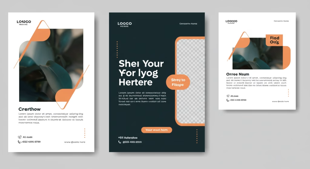
Flyers and brochures offer more space to develop your visual story. Start with a captivating image or graphic that sets the tone. Use hierarchy to guide the reader through sections, perhaps with larger headings for each topic. Employ repetition by using consistent branding elements throughout. Ensure all text and images are aligned to create a professional and organized look. Use proximity to group related information, such as services offered or contact details.
Imagine designing a brochure for a local coffee shop. The cover might feature an inviting image of a coffee cup. Inside, headings like “Our Story,” “Our Menu,” and “Find Us” guide the reader. Menu items are grouped together using proximity. Consistent fonts and colors reinforce the brand identity. The entire layout is aligned for a clean, readable experience, telling the story of a welcoming and organized establishment.
Creating an Impactful Logo
A logo is perhaps the most condensed form of visual storytelling. It must communicate a brand’s essence in a single, memorable graphic. Hierarchy might involve a prominent icon with a smaller, supporting wordmark. Contrast can be used in the color palette to make the logo stand out. Repetition of shapes or colors can create a cohesive design. Alignment and proximity are crucial for ensuring all elements work together harmoniously.
Consider the Nike swoosh. It’s a simple, dynamic shape that evokes movement and speed – telling a story of athleticism and achievement without words. The logo’s simplicity, combined with its strong visual impact, makes it instantly recognizable and memorable, a testament to effective visual storytelling through design. Similarly, the Apple logo, with its clean, minimalist design, communicates innovation and user-friendliness.
The Emotional Connection: Beyond Aesthetics
Beyond simply conveying information, effective Visual Storytelling also aims to evoke emotion. Colors, shapes, and even the choice of imagery can significantly influence how your audience feels about your message. A warm color palette might evoke comfort, while sharp, angular shapes could convey strength or urgency. Understanding these emotional connections allows you to tell a story that resonates on a deeper level.
For example, non-profit organizations often use images of people smiling or looking hopeful to tell a story of positive impact and inspire empathy and support. Conversely, a cybersecurity company might use dark colors and abstract, interconnected shapes to convey security and complexity. The visual choices are deliberate, designed to create a specific emotional response that reinforces the overall narrative.
The beauty of visual storytelling is its universality. Images transcend language barriers, allowing your message to reach a wider audience. A powerful visual can communicate more effectively and quickly than pages of text, making it an indispensable skill for anyone looking to create impactful designs.
The Continuous Journey of a Visual Storyteller
Learning visual storytelling is an ongoing process of observation and practice. Start by analyzing the designs you encounter daily. What story are they telling? How do they use hierarchy, contrast, repetition, alignment, and proximity? The more you observe, the more you’ll train your eye to understand the mechanics behind compelling visuals.
Then, start experimenting in your own projects. Don’t be afraid to try different layouts, color combinations, and font pairings. The more you practice, the more intuitive these principles will become. Remember, every design is an opportunity to tell a story, and with these fundamental principles, you have the tools to make your story heard loud and clear.
For further exploration into the principles of design and their application, consider resources like The Interaction Design Foundation, which offers comprehensive articles and courses on visual design and user experience, or Adobe’s resources on visual design, providing insights into various design elements and their impact. These platforms can deepen your understanding and help you refine your visual storytelling skills.
Recommended Reading:
The Importance of Color Theory in Design” and “Understanding Typography for Beginners“


