An Essential Guide for Design Beginners
The psychology of color is a field of study that explores how colors affect human behavior, emotions, and perceptions. For beginners in the world of design, understanding this area is crucial, as colors are not just aesthetic elements, but powerful communication tools. A well-chosen color palette can evoke specific feelings, influence purchasing decisions, and even shape a brand’s identity. This article aims to demystify the psychology of color, offering a comprehensive guide for beginners, with practical examples, case studies, and valuable tips.
Table of Contents
The Basis of Chromatic Perception: How We See Colors
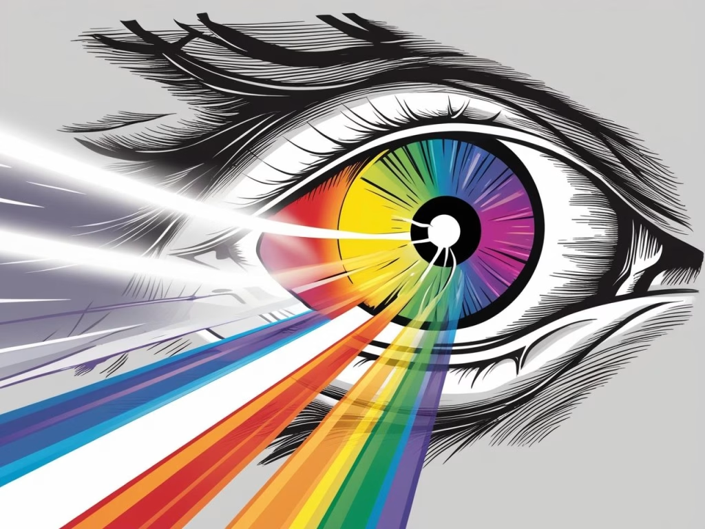
Before diving into the psychology of color, it’s essential to understand how we perceive colors. Human vision is a complex process involving the interaction of light with the eyes and the brain. White light, which contains all the colors of the visible spectrum, is absorbed or reflected by objects. The colors we see are those that have not been absorbed, but rather reflected.
The Visible Spectrum and Color Theory
The visible spectrum is the range of electromagnetic radiation that our eyes are capable of detecting. It extends from red to violet, passing through all the colors of the rainbow. Color theory, in turn, is a set of principles that describe how colors relate to each other.
- Primary Colors: Red, blue, and yellow. They are called primary because they cannot be obtained by mixing other colors.
- Secondary Colors: Orange (red + yellow), green (blue + yellow), and violet (blue + red). They are obtained by mixing two primary colors.
- Tertiary Colors: These are obtained by mixing a primary color with an adjacent secondary color on the color wheel, such as red-orange, yellow-green, among others.
In addition, the concept of hue (the pure color), saturation (the intensity of the color), and brightness (the amount of light in the color) are crucial to understanding how colors are perceived and used in design.
The Cultural and Individual Influence on Color Perception
It’s important to note that color perception is not universal. It is influenced by cultural, social, and individual factors. For example, white is associated with purity and peace in Western culture, but it is the color of mourning in some Eastern cultures. Furthermore, personal experiences and emotional associations can also shape how each individual perceives and reacts to a particular color.
The Emotional Impact of Colors: Unveiling the Meaning
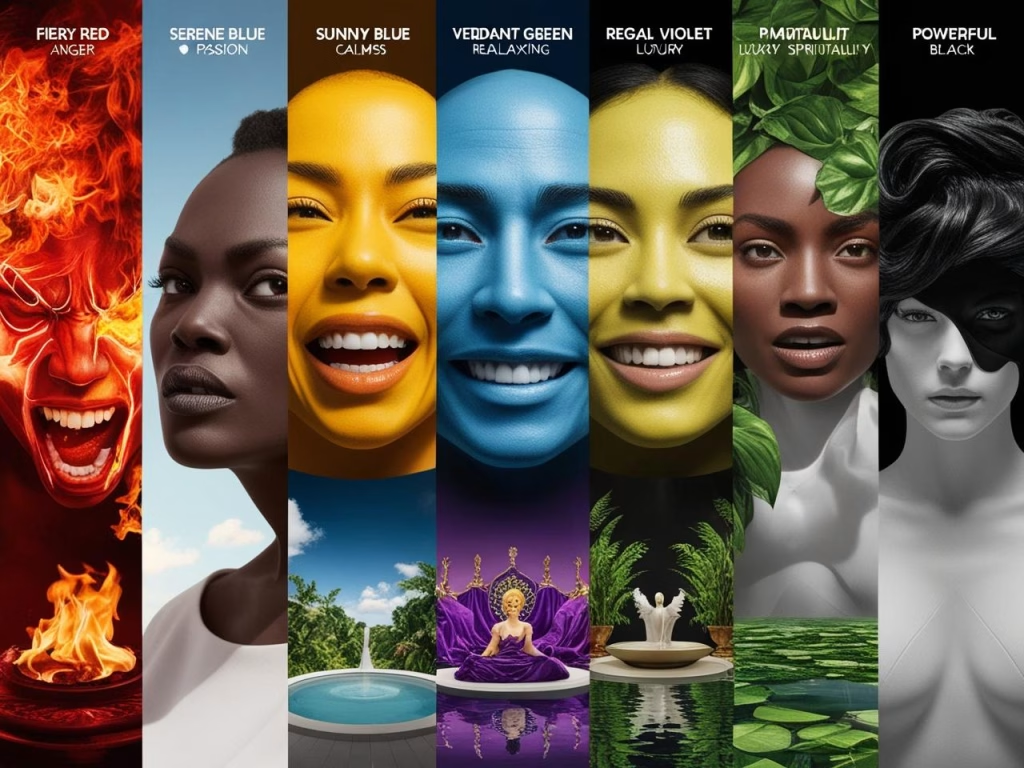
The psychology of color reveals that each color has the potential to evoke a specific range of emotions and associations. Understanding this emotional impact is essential for designers who want to create effective and engaging projects.
Warm Colors: Energy and Action
Warm colors, such as red, orange, and yellow, are often associated with energy, passion, warmth, and excitement. They tend to be stimulating and can draw the observer’s attention.
- Red: Evokes passion, love, anger, danger, and urgency. It is a powerful color that can increase heart rate and blood pressure. In design, it is often used for call-to-action buttons, promotions, and alerts.
- Practical Example: Fast-food brands like McDonald’s and Coca-Cola use red in their logos to attract attention and create a sense of urgency.
- Case Study: A study from the University of Rochester showed that the color red can improve performance in tasks that require attention to detail, but it can also increase anxiety in some people.
- Orange: Represents enthusiasm, creativity, joy, and optimism. It is a vibrant color that conveys energy and vitality.
- Practical Example: Nickelodeon, a children’s channel, uses orange to convey fun and energy.
- Case Study: Research from the University of Maryland indicated that orange is effective for stimulating appetite and communication.
- Yellow: Symbolizes happiness, optimism, intellect, and attention. It is a bright color that can be used to draw attention and create a sense of positivity.
- Practical Example: Brands like Post-it use yellow to highlight importance and visibility.
- Case Study: A study from the University of Sussex showed that yellow can improve mood and increase creativity.
Cool Colors: Calm and Trust
Cool colors, such as blue, green, and violet, are associated with calm, tranquility, trust, and professionalism. They tend to be relaxing and can create a sense of peace and harmony.
- Blue: Evokes trust, security, loyalty, and professionalism. It is a color often used by technology, finance, and healthcare companies.
- Practical Example: Facebook, Twitter, and LinkedIn use blue in their logos to convey trust and stability.
- Case Study: A study from Harvard University showed that blue can reduce stress and anxiety, as well as increase productivity.
- Green: Represents nature, growth, health, balance, and renewal. It is a color often used by companies that care about the environment and sustainability.
- Practical Example: Whole Foods Market uses green in its brand to convey an image of natural and healthy products.
- Case Study: Research from the University of Washington showed that green can improve concentration and reduce visual fatigue.
- Violet: Symbolizes luxury, creativity, spirituality, and wisdom. It is a color often used by fashion, beauty, and high-quality product brands.
- Practical Example: Brands like Cadbury use violet to convey a sense of sophistication and exclusivity.
- Case Study: A study from the University of Oxford indicated that violet can stimulate imagination and creativity.
Neutral Colors: Versatility and Sophistication
Neutral colors, such as white, black, gray, and beige, are versatile and can be used to create a variety of effects in design. They are often used as a background to highlight other colors and can convey a sense of elegance and sophistication.
- White: Evokes purity, peace, innocence, and simplicity. It is a color often used in minimalist designs and in areas where clarity and cleanliness are sought.
- Practical Example: Apple uses white in its products to convey an image of simplicity and elegance.
- Case Study: A study from Stanford University showed that white can increase the feeling of space and lightness.
- Black: Represents power, sophistication, elegance, and mystery. It is a color often used by luxury brands and in designs that seek to convey a sense of exclusivity.
- Practical Example: Brands like Chanel and Dior use black in their logos and packaging to convey an image of luxury and sophistication.
- Case Study: Research from Yale University indicated that black can increase the feeling of authority and power.
- Gray: Symbolizes neutrality, balance, sophistication, and stability. It is a color often used as a background and in designs that seek to convey a sense of professionalism.
- Practical Example: Many technology companies use gray on their websites and apps to convey a sense of modernity and professionalism.
- Case Study: A study from the University of Michigan showed that gray can improve concentration and reduce distraction.
- Beige: Evokes calm, comfort, simplicity, and naturalness. It is a color often used in designs that seek to convey a sense of coziness and tranquility.
- Practical Example: Brands of natural products and home decor use beige in their packaging and marketing materials.
- Case Study: Research from Indiana University indicated that beige can create a relaxing and welcoming environment.
The Practical Application of Color Psychology in Design
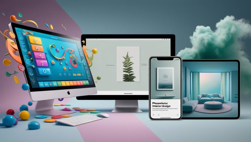
Understanding the psychology of color is essential for designers of all types, from web designers and graphic designers to architects and interior designers. Choosing the right colors can make all the difference in the success of a project.
User Interface (UI/UX) Design
In user interface (UI/UX) design, the psychology of color plays a crucial role in creating intuitive and enjoyable user experiences. Colors can be used to guide the user through the interface, highlight important elements, and create a sense of brand identity.
- Call-to-Action Buttons: Colors like red, orange, and green are often used for call-to-action buttons because they draw attention and encourage the user to interact.
- Alerts and Notifications: Colors like red and yellow are used to alert the user to errors or important information.
- Navigation: Colors like blue and green are used to create intuitive and easy-to-use navigation.
- Branding: The choice of brand colors is essential to create a consistent and memorable visual identity.
Graphic Design
In graphic design, the psychology of color is used to create effective marketing materials, such as logos, posters, brochures, and packaging. Colors can be used to convey the brand’s message, attract the target audience, and create a unique visual identity.
- Logos: The choice of logo colors is essential to create a strong and memorable brand image.
- Packaging: The colors of the packaging can influence the consumer’s purchasing decision, conveying information about the product and its benefits.
- Marketing Materials: The colors of marketing materials, such as posters and brochures, can be used to attract the public’s attention and convey the brand’s message effectively.
Interior Design
In interior design, the psychology of color is used to create environments that affect people’s mood and well-being. Colors can be used to create different atmospheres, such as relaxing, stimulating, or productive spaces.
- Bedrooms: Colors like blue and green are often used in bedrooms to create a relaxing and sleep-promoting environment.
- Offices: Colors like yellow and green are used in offices to stimulate creativity and productivity.
- Living Rooms: Colors like beige and gray are used in living rooms to create a welcoming and comfortable environment.
- Restaurants: The colors of restaurants can influence the appetite and mood of customers.
Case Studies and Practical Examples
- Success Story: McDonald’s: The use of red and yellow in McDonald’s logo and visual identity is a classic example of how colors can be used to attract attention and create a sense of urgency.
- Success Story: Facebook: The use of blue in the Facebook logo and interface conveys trust and stability.
- Success Story: Whole Foods Market: The use of green in the Whole Foods Market brand conveys an image of natural and healthy products.
Essential Tips for Beginners in Color Psychology
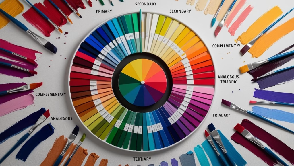
For beginners in the world of design, the psychology of color may seem like a complex and challenging field. However, with a little study and practice, it is possible to master the basic principles and apply this knowledge in effective design projects.
Start with the Basics: The Color Wheel
The color wheel is a fundamental tool for understanding the relationships between colors. Start by studying the primary, secondary, and tertiary colors, and how they relate to each other.
- Complementary Colors: Colors opposite each other on the color wheel, such as red and green, blue and orange, and yellow and violet. They create a strong contrast and are used to draw attention.
- Analogous Colors: Colors that are next to each other on the color wheel, such as blue, blue-green, and green. They create a sense of harmony and balance.
- Triadic Colors: Three colors that are equidistant on the color wheel, such as red, yellow, and blue. They create a balanced and dynamic contrast.
Experiment and Observe
The best way to learn about the psychology of color is by experimenting and observing how colors affect the people around you. Create different color palettes and see how they behave in different contexts.
- Test with Friends and Colleagues: Ask friends and colleagues for their opinions on the color palettes you have created.
- Analyze Successful Projects: Observe how experienced designers use colors in their projects and try to understand the reasoning behind their choices.
Consider the Cultural and Individual Context
Remember that color perception is influenced by cultural, social, and individual factors. When choosing colors for a project, consider the target audience and the context in which it will be used.
- Research the Target Audience: Before starting a project, research the target audience to understand their preferences and cultural associations.
- Adapt Colors to the Context: Adapt the colors to the context in which the project will be used, taking into account the environment, lighting, and other relevant factors.
Use Useful Tools and Resources
There are several useful tools and resources that can help beginners learn and apply the psychology of color.
- Adobe Color: A free online tool that allows you to create and explore color palettes.
- Coolors: Another online tool that offers a variety of pre-defined color palettes and allows you to create your own palettes.
- Books and Articles: Consult books and articles on the psychology of color to deepen your knowledge.
Recommended Books for Beginners
- “Color Psychology Made Simple“ by EM SANS: This book compiles and synthesizes some of the most relevant aspects about Color Psychology, its meanings, influences, connotations and applications. It is divided into 10 main colors: White, Yellow, Orange, Red, Pink, Purple, Blue, Green, Brown and Black. Inside, you will find several sections, guidelines and simplified methods that will help you select the optimal colors for your creative Branding, Marketing, Graphic Design and Art projects.. (Available on Amazon)
- “Color Design Workbook: A Real-World Guide to Understanding Color“ by Terry Lee Stone: A practical and comprehensive guide to the use of colors in design. (Available on Amazon)
- “Interaction of Color” by Josef Albers: An iconic book that explores color theory and its applications in design. (Available on Amazon)
Conclusion: The Continuous Journey of Learning
The psychology of color is a fascinating and constantly evolving field. For beginners in the world of design, the learning journey is continuous. By mastering the basic principles, experimenting with different color palettes, and considering the cultural and individual context, it is possible to create effective and engaging design projects. Remember that choosing the right colors can make all the difference in the success of a project and how it is perceived by the public. Therefore, embrace the psychology of color and use it as a powerful tool to express your creativity and achieve your design goals.
Ready to deepen your knowledge in design and the psychology of color?
Subscribe to our newsletter and receive exclusive content, practical tips, and the latest news from the design world directly in your email. Don’t miss the opportunity to improve your skills and stand out in the market!
We always strongly recommend that if you are a beginner, you read the article “What is Graphic Design? Essential Concepts for Aspirants“.
