Understanding How We See: An Introduction to Gestalt Principles
Have you ever wondered why certain designs just “make sense” to your eyes, while others feel chaotic or hard to understand? The secret often lies in how our brains naturally organize visual information. This is precisely what Gestalt Principles explore. Originating from early 20th-century German psychology, these principles describe how humans perceive objects as organized patterns or wholes rather than individual parts. Understanding these principles is fundamental for anyone looking to create more beautiful, organized, and functional visual materials, even without prior design experience. They are the bedrock of effective visual perception, guiding how elements are grouped and interpreted.
In our daily lives, we constantly apply these principles without even realizing it. When you look at a forest, you don’t just see individual trees; you perceive the forest as a whole. When you read a paragraph, you see words and sentences, not just disconnected letters. These innate mental shortcuts are what designers leverage to create compelling and intuitive experiences. By mastering these grouping principles, you gain a powerful tool to influence how your audience perceives your message and interacts with your design. It’s about understanding the underlying design psychology that governs human sight.
Table of Contents
The Core Gestalt Principles
Let’s dive into the most essential Gestalt Principles, breaking down how each one influences our visual understanding and helps in visual organization.
Proximity: Nearness Creates Connection
The Principle of Proximity states that objects that are close to one another tend to be perceived as a group. Our brains naturally assume that elements placed near each other are related. Think about a list of bullet points: if the spacing between items is consistent, you see them as one list. If there’s a larger gap, you’ll perceive separate sections. In design, this means grouping related information visually, whether it’s text, icons, or images, by simply placing them closer together. This principle is vital for creating clear hierarchies and preventing visual clutter.
Similarity: Like Elements Belong Together
The Principle of Similarity suggests that elements sharing visual characteristics (like color, shape, size, or orientation) are perceived as more related than elements that don’t share those characteristics. If you have a collection of circles and squares, your brain will naturally group all the circles together and all the squares together. Designers use similarity to indicate relationships or categories. For instance, all clickable buttons on a website might have the same color and rounded corners, signaling their common function. This helps in quick recognition and intuitive navigation, a key aspect of cognitive design.
Closure: Our Brains Fill in the Gaps
The Principle of Closure posits that our brains tend to complete incomplete shapes or figures. Even if a shape isn’t fully drawn, if enough visual information is present, we will perceive it as a whole. Think of a dashed circle: you still see it as a circle, not just a series of dashes. This principle is powerful for creating minimalist designs that engage the viewer’s mind, allowing them to actively participate in completing the image. It can make logos memorable and designs intriguing by suggesting forms without fully rendering them.
Continuity: Following the Flow
The Principle of Continuity states that our eyes tend to follow lines, curves, or a direction, and prefer to see continuous forms rather than broken ones. We perceive elements arranged on a line or curve as related, even if they are distinctly separate objects. Imagine a winding road on a map; your eye naturally follows its path. In design, continuity can guide the viewer’s gaze through a layout, creating a smooth visual flow from one element to the next. This is crucial for guiding users through content or a user interface in a logical manner.
Figure-Ground: What Stands Out and What Recedes
The Principle of Figure-Ground describes our tendency to separate elements into a foreground (the “figure”) and a background (the “ground”). Our perception constantly shifts between what we focus on and what we perceive as secondary. A classic example is the Rubin’s vase illusion, where you might see either a vase or two faces in profile, but not both simultaneously. Designers use this principle to ensure that the most important information or element (the figure) stands out clearly against its surroundings (the ground), preventing visual confusion and emphasizing key messages.
Common Fate: Moving Together, Belonging Together
The Principle of Common Fate suggests that elements that move in the same direction or at the same speed are perceived as a single group. While this principle is often applied to animated or dynamic designs (like a flock of birds flying in unison), it also has static applications. For instance, a series of arrows all pointing in the same direction can indicate a common purpose or destination. In user interfaces, elements that appear or disappear together, or scroll in sync, are understood as related components.
Symmetry: Balance and Order
The Principle of Symmetry states that symmetrical elements are perceived as belonging together and creating a sense of balance, order, and harmony. Our brains naturally seek out symmetry because it implies stability and structure. While perfect symmetry isn’t always necessary, a balanced composition, whether symmetrical or asymmetrical, contributes to a pleasing and stable visual experience. Symmetrical layouts often convey formality and elegance, making them suitable for certain branding or informational designs.
Applying Gestalt Principles in Your Designs
Understanding these principles is just the first step; the real magic happens when you apply them. Here’s how you can use Gestalt Principles to enhance your design projects, from simple social media posts to complex logos, improving their overall visual organization.
Designing a Social Media Post
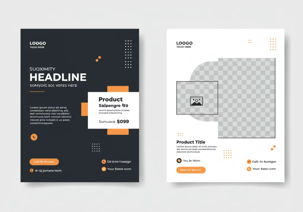
When creating a social media graphic, think about Proximity. Group your headline and subtext closely together. Place your call-to-action button or link near the relevant text. Use Similarity by ensuring all icons or bullet points have a consistent style, color, and size. This makes the information digestible and visually appealing. For example, if you have a product image and a description, place them near each other (Proximity) and ensure the product title and price use similar fonts or colors (Similarity) to create a cohesive unit.

Crafting a Memorable Logo
Logos are prime examples of Gestalt Principles in action. Many iconic logos use Closure to hint at a form without fully drawing it, inviting the viewer’s mind to complete the picture (e.g., the FedEx arrow, the panda in the WWF logo). Figure-Ground relationships are also crucial; a well-designed logo ensures its primary symbol stands out clearly. Consider how the negative space around your logo elements can form a secondary image or reinforce the main one. Symmetry can convey trust and timelessness, making a logo feel established and balanced.
Organizing Information in a Flyer
For a flyer or brochure, Continuity helps guide the reader’s eye through the content. Use lines, arrows, or a consistent flow of elements to direct attention from one section to the next. Symmetry or a balanced asymmetrical layout (using the principle of Balance, a broader concept related to Gestalt) can make the flyer feel organized and professional. Use Proximity to group related text blocks and images, and Similarity to differentiate headings from body text, or to distinguish different categories of information.
Deepening Your Understanding: External Resources
To further your knowledge of Gestalt Principles and their application in design, exploring reputable external resources is highly recommended. These principles are extensively covered in various fields beyond graphic design, including psychology and human-computer interaction.
- Gestalt Principles by Interaction Design Foundation – A comprehensive resource offering detailed explanations and examples of each principle, perfect for those delving deeper into design psychology.
Observe, Apply, Create!
The beauty of Gestalt Principles is that they are not abstract theories but practical tools rooted in how our brains are wired. By understanding how people naturally perceive and organize visual information, you gain an immense advantage in creating designs that are not only aesthetically pleasing but also highly effective and intuitive. Start by observing the world around you: notice how signs are grouped, how websites organize their navigation, or how logos subtly convey meaning. Then, begin applying these principles consciously in your own projects. With practice, you’ll find yourself creating designs that resonate more deeply with your audience, making your visual communication clearer, more impactful, and truly professional. Embrace these fundamentals, and unlock your potential to create truly engaging and organized visual experiences.
Want to learn more about the fundamentals of design? Check out our category: Design Fundamentals.


