Create Your First Eye-Catching Simple Flyer in Canva, Step-by-Step!
Feeling a bit overwhelmed by graphic design? Do you wish you could create your own eye-catching marketing materials like a Simple Flyer without complex software or a huge budget? You’re not alone! Many aspiring designers find the first step the hardest, but with the right guidance and an accessible tool like Canva, you can bring your ideas to life quickly and easily.
This comprehensive guide is crafted specifically for beginners. We’ll walk you through everything you need to know, from understanding basic design principles to using Canva’s intuitive features, all to help you create a professional-looking flyer. Get ready to transform your creative vision into a tangible design that gets noticed, empowering you to create your own materials for local events, small businesses, or personal projects.
Table of Contents
Why Design a Simple Flyer in Canva?
Flyers are incredibly versatile and effective tools for communication. Whether you’re promoting a local bake sale, advertising a small business service, or inviting friends to an event, a well-designed flyer can grab attention and convey your message instantly. For beginners, creating a flyer might seem daunting, but Canva makes the process accessible and enjoyable.
Canva is a popular online graphic design platform known for its user-friendly interface and extensive library of templates. It removes the steep learning curve associated with traditional design software, allowing you to focus on your message and creativity. With Canva, you can achieve professional-looking results quickly, making it the perfect tool for your first design projects. Its drag-and-drop functionality and vast collection of free elements simplify complex design tasks, turning frustration into fun.
Materials You’ll Need
Before we dive into the design process, make sure you have these basic materials ready:
- Canva Account: A free Canva account is all you need to get started. You can sign up quickly on their website.
- Computer or Mobile Device: Canva works seamlessly on both desktop and mobile, so choose what’s most comfortable for you.
- Your Message/Information: Have all the text ready – headline, event details, contact information, and any brief descriptions.
- Images or Logos (Optional): If you have specific photos or a logo you want to include, have them ready to upload. If not, Canva offers a vast library of free stock images and icons.
- Time: Dedicate about 30-60 minutes of focused time. You’ll be surprised how quickly you can create something impactful!
Understanding the Basics of a Great Flyer Design
Even a Simple Flyer benefits from understanding a few core design principles. These aren’t complicated rules, but rather guidelines that make your design clear, effective, and visually appealing. Applying these concepts will elevate your flyer from amateur to professional.
Clarity & Hierarchy: Make Your Message Pop
The most important thing on your flyer should be the most noticeable. This is called Visual Hierarchy. Decide what your main message is (e.g., “Grand Opening!”). Make it larger, bolder, or a contrasting color so it stands out immediately. Secondary information should be less prominent but still easy to find. This guides the viewer’s eye through your flyer in a logical order.
Readability: Easy on the Eyes
If people can’t read your flyer, it won’t be effective. Choose fonts that are clear and easy to read, even from a distance. Ensure there’s enough contrast between your text color and the background color. Avoid overly decorative fonts for large blocks of text. Good Typography ensures your message is received loud and clear.
Brand Consistency: Your Visual Signature
Even for a personal project or a small local event, using consistent colors and fonts helps build recognition. If you have a brand logo or specific colors, incorporate them. If not, choose a simple color palette (2-3 colors) and stick to it. This creates a cohesive and professional look.
Call to Action: What’s Next?
Every good flyer needs a clear “Call to Action” (CTA). What do you want people to do after reading your flyer? “RSVP Now!”, “Visit Our Store!”, “Scan for Details!” Make this action prominent and easy to understand. Use a button shape or a contrasting color to make it stand out.
Simplicity: Less is More
Resist the urge to cram every piece of information onto your flyer. Overcrowding makes a design messy and overwhelming. Focus on your key message and essential details. Use Whitespace (empty space) around elements to give your design room to breathe. A clean, uncluttered flyer is much more inviting and effective.
Step-by-Step: Design Your Simple Flyer in Canva
Let’s get hands-on and create your first Simple Flyer using Canva. Follow these steps, and you’ll have a professional-looking flyer ready in no time!
Step 1: Start Your Project in Canva
First, open Canva in your web browser or launch the app on your device. Once logged in, you’ll see various design options. Type “Flyer” into the search bar, or select the “Flyer” option if it’s readily visible. This will give you a canvas with the correct dimensions for a standard flyer.
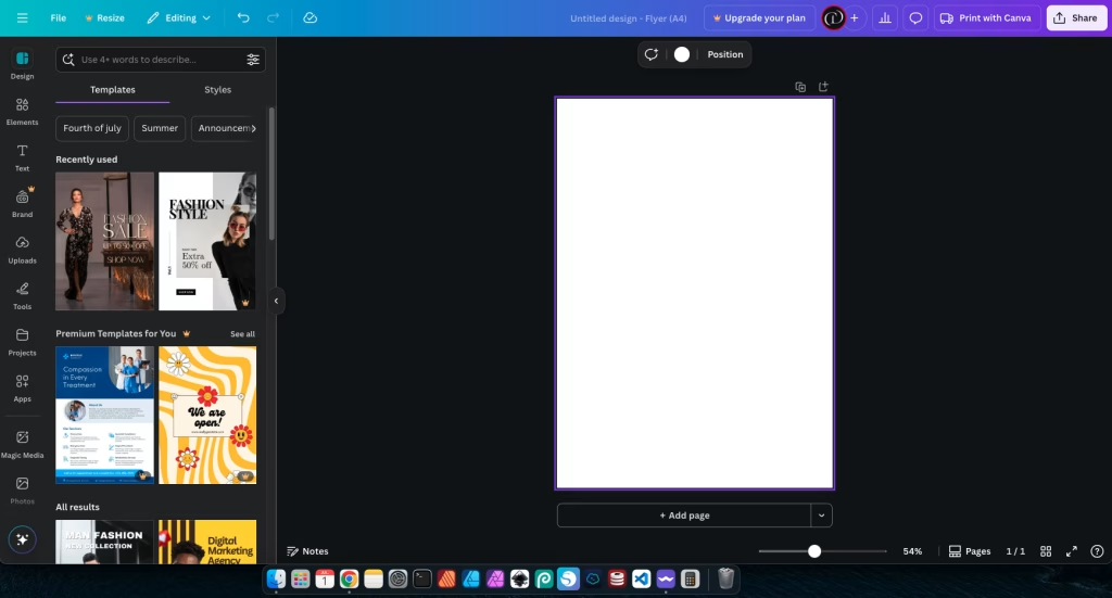
Canva will then offer you a wide selection of pre-designed templates. For beginners, choosing a template is an excellent starting point as it provides a solid foundation for layout and visual appeal. Browse through them and pick one that generally fits the theme or mood of your flyer, even if the colors or text aren’t perfect yet. You can always start from a blank canvas if you prefer, but a template saves a lot of time.
Step 2: Customize Your Background
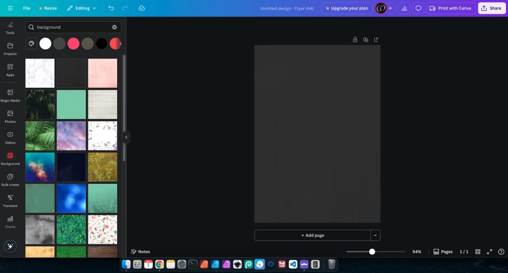
The background sets the overall mood for your flyer. Click on the background of your chosen template (or the blank canvas if you started fresh). On the left sidebar, you’ll find “Background” options. You can choose a solid color, a gradient, a pattern, or even a subtle image.
When selecting your background, remember Color Psychology. A bright, energetic color might be great for a party flyer, while a softer, muted tone could suit a community event. Ensure your background doesn’t compete with your text or main visuals. Simplicity is key here; a busy background will make your flyer hard to read.
Step 3: Add Your Main Headline
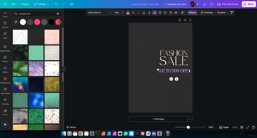
Your headline is the most important piece of text on your flyer – it needs to grab attention instantly. On the left sidebar, click on “Text.” You can choose from pre-designed text combinations or click “Add a heading.”
Type your main message, such as “Grand Opening Sale!” or “Summer Festival Fun!” Make it large and bold to create strong Simple Flyer impact using Visual Hierarchy. Position it prominently at the top or center of your flyer. Ensure there’s a strong contrast between your headline’s color and the background so it’s easy to read at a glance.

Step 4: Add Supporting Information
Now it’s time to add the essential details that support your main message. This includes things like the date, time, location, a brief description of your event or offer, and any other key information. Click “Text” again and choose “Add a subheading” or “Add a body of text” for these details.
When adding this information, focus on Typography for readability. Choose a clear, legible font, usually smaller than your headline but still easily readable. Use Proximity to group related information together (e.g., keep the date and time close to each other). Use Alignment to create a clean, organized look – aligning text to the left margin is often the easiest and most readable. Keep paragraphs short, ideally under 500 characters, to make them digestible.
Step 5: Incorporate Images or Icons (Optional)
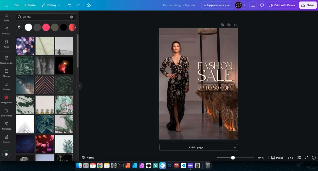
Visuals can significantly enhance your flyer’s appeal. On the left sidebar, click “Elements” to browse Canva’s vast library of graphics, icons, and illustrations, or click “Uploads” to add your own photos or logos. If you use your own images, ensure they are high-quality and clear.
When adding Visual Elements, make sure they complement your message and don’t distract from the text. Position them strategically to support your overall layout and guide the eye. For example, a small, relevant icon next to a piece of information can make it more engaging. Remember the principle of simplicity; don’t overcrowd your flyer with too many images.
Step 6: Design Your Call to Action (CTA)
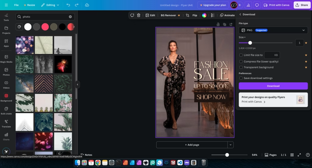
This is arguably the most critical part of your Simple Flyer: telling people what you want them to do next. A strong Call to Action (CTA) should be impossible to miss. Go to “Elements” and search for “shapes” or “buttons” to create a distinct background for your CTA text.
Type your CTA (e.g., “RSVP by July 1st!”, “Visit Our Website!”, “Scan for Tickets!”). Make this text bold and use a contrasting color that stands out against the button shape and the rest of the flyer. Give your CTA plenty of Whitespace around it so it “pops” and draws the eye. This ensures your audience knows exactly what step to take next.

Step 7: Review, Refine, and Download
You’re almost there! Before you finalize your flyer, take a moment for Design Review. Check for any typos or grammatical errors in your text. Look at the overall balance and ensure all elements are properly aligned. Is the text readable? Is the main message clear? Is the CTA prominent?
Consider getting feedback from a friend or colleague. A fresh pair of eyes can often spot things you missed. Once you’re happy with your design, click the “Share” button in the top right corner. You’ll then have options to download your flyer. For printing, choose “PDF Print” for high quality. For digital sharing (email, social media), choose “PNG” (for best quality) or “JPG” (for smaller file size). Canva makes it easy to prepare your flyer for any use.
Tips for an Impactful Simple Flyer
To make your Simple Flyer truly shine, keep these expert tips in mind:
- Keep it Simple: This cannot be stressed enough. A flyer should convey its message quickly. Focus on one clear message and limit supporting details to the absolute essentials. Don’t be afraid of empty space; it helps your design breathe.
- Use High-Quality Visuals: Even if you’re using free stock photos from Canva’s library, ensure they are high-resolution and don’t appear pixelated. A blurry image instantly makes your flyer look unprofessional.
- Readability First: Always prioritize making your text easy to read. This means choosing legible fonts, ensuring sufficient contrast between text and background colors, and using appropriate font sizes. Test your flyer on different screens and even print a draft to check readability.
- Brand Consistency: If this flyer is for a business or personal brand, ensure the colors, fonts, and overall style align with your existing branding. Consistency builds recognition and trust.
- Test Your Design: Before mass printing or widely sharing, print a test copy of your flyer. Look at it from different distances. Does it still make sense? Is the important information clear? Also, view it on a phone screen to ensure it looks good digitally.
- Utilize Canva’s Features: Explore Canva’s full potential. Use their alignment guides, grouping features, and transparency tools to refine your design. The more comfortable you get with the platform, the more polished your results will be.
- Consider Your Audience: Always design with your target audience in mind. What colors and imagery resonate with them? What kind of language do they use? Tailoring your design to your audience makes it more effective.
- Less is More with Effects: While Canva offers many effects, use them sparingly. Too many shadows, glows, or filters can make a flyer look cluttered and dated. Subtle enhancements are usually more effective.
For more design insights, consider exploring Canva’s Official Flyer Design Tips directly from the source. Their articles often provide valuable advice on leveraging their platform effectively for various design needs.
Common Mistakes to Avoid
Even with Canva’s intuitive interface, some common pitfalls can make your Simple Flyer less effective. Being aware of these helps you sidestep them:
- Overcrowding the Flyer: This is perhaps the most common mistake. Trying to fit too much text, too many images, or too many competing elements onto a small flyer makes it look messy and overwhelming. Viewers won’t know where to look.
- Using Too Many Fonts or Clashing Colors: A chaotic mix of typefaces and a jarring color palette make your flyer look unprofessional and hard to read. Stick to a maximum of two complementary fonts and a cohesive color scheme.
- Poor Contrast for Text: Text that blends into the background is unreadable. Always ensure strong contrast between your text and its background. This is crucial for accessibility and basic readability.
- No Clear Call to Action: If your flyer doesn’t tell people what to do next (e.g., “Call Now,” “Visit Website”), it loses its purpose. Make your CTA prominent and unmistakable.
- Ignoring Margins and Whitespace: Neglecting the empty space around your content makes your flyer feel cramped and busy. Give your elements room to breathe; whitespace improves readability and visual appeal.
- Using Low-Resolution Images: Pixelated or blurry images instantly cheapen your design. Always use high-quality images that are sharp and clear, suitable for the intended output (print or digital).
- Inconsistent Alignment: Elements placed haphazardly without proper alignment look messy and unprofessional. Use Canva’s alignment tools and guides to create a clean, organized layout.
- Forgetting to Proofread: Typos and grammatical errors undermine your credibility. Always proofread all text on your flyer carefully before finalizing. Ask someone else to review it too!
Conclusion: Your Flyer Journey Begins!
Congratulations! You’ve just taken a significant step in your design journey. Learning how to create a Simple Flyer in Canva empowers you to produce professional-looking marketing materials with ease. You’ve discovered how accessible design can be, even for beginners, and how powerful basic principles like hierarchy, readability, and simplicity are.
Remember that practice is key. The more you experiment with Canva, apply these tips, and create new designs, the more confident and skilled you’ll become. Don’t be afraid to try new layouts, explore different color combinations, and continuously refine your work. Every design you create is an opportunity to learn and grow.
So go ahead, unleash your creativity! Design that party invitation, promote your small business, or announce your next event with a stunning flyer you made yourself. The world is waiting to see what you create!
Recommended reading:
– Canva Tutorial for Beginners – Learn the basics of using Canva to create stunning designs easily.
